

The introduction of the Redwood theme in Oracle Analytics represents the culmination of Oracle’s long-term, serious commitment to leading practices in user interface design. Redwood introduces a unified look and feel across all Oracle products that includes fonts, color palettes, menu layouts, and a consistent strategy behind callouts. In this blog, however, we are going to focus on the use of color in visualizations.
In the world of visual analytics, the strategy behind color choices for various graph elements is extremely important. While it’s clear that the Oracle design team has thought a lot about user interface design principles in general, we have some recommendations for using Redwood that should help some of your data visualizations in Oracle Analytics Cloud.
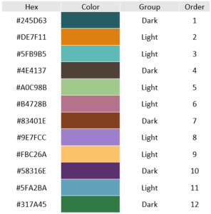
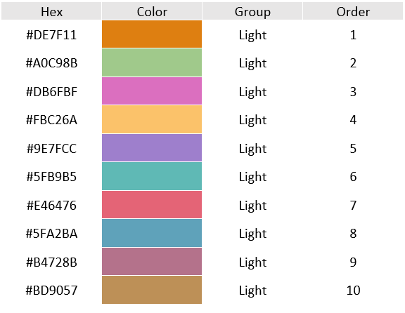
The Oracle JET JavaScript Extension Toolkit for Redwood specification (which you can read here: https://docs.oracle.com/en/middleware/developer-tools/jet/11/reference-styling/CssVariablesOverview.html) identifies 12 colors for data visualization. These 12 colors were put into Oracle Analytics in the order shown below.
Analyzing the Default Data Visualization Colors
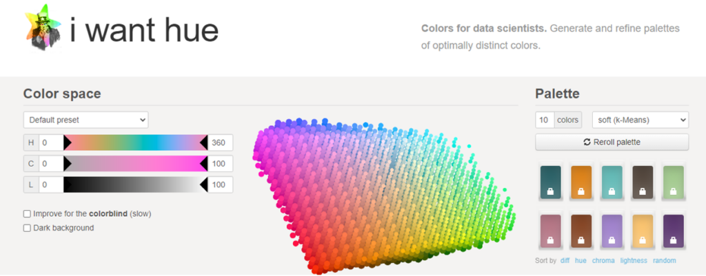
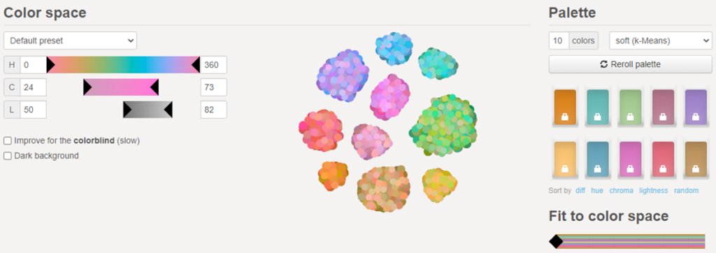
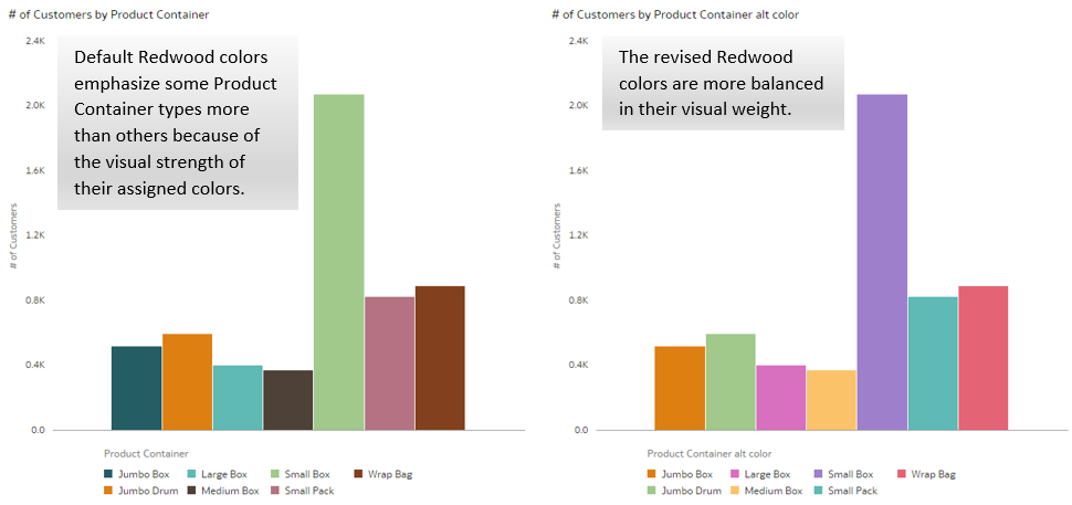
We wanted to learn more about these colors so we plugged them into a website that we often use to create balanced color palettes called iwanthue. The iWantHue site was built specifically for use by data scientists and has a tremendous amount of information about colors and how they appear in human perception. iWantHue automatically generates color palettes of optimally distinct colors by letting users refine the Hue (H), Chroma (C), and Lightness (L) of a three-dimensional array of colors. Our general goal for data visualization is to represent data values in a way that is as objective and non-biased as possible. To do that, we want to use colors of similar visual weight and intensity so that we don’t unintentionally call more attention to some members of a categorical set than others. The screenshot below shows the full color space available and the first 10 colors of the Redwood data visualization palette.
As we edit each individual color, we get a representation of the color space that it belongs to. The CIELAB color space shown here is a three-dimensional “twisted saddle” shape. (A color space is a mathematical abstraction of the position of different colors relative to all the others. They may be close in one dimension but further away in others) Our eyes naturally distinguish between certain colors more than others and we can see more range for some hues than others. Furthermore, some hues appear to be brighter or have more presence than others. The developers that built iWantHue have included tools that help us understand how the human eye perceives colors, both individually and in pair-wise comparisons. Below is a screenshot of the first two colors.
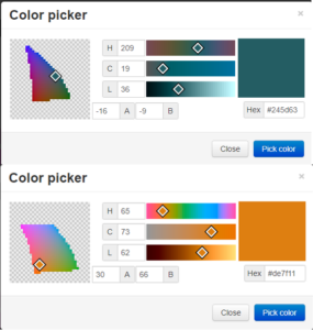
Notice that the dark green color has a mostly triangular shape to its projection of the three-dimensional saddle onto the screen while the lighter orange color has a generally rectangular (rhombus) shape to it. We categorized the colors either as “dark” or “light” based on the “L” value and based on their shape. When we use iWantHue to design custom palettes for the purpose of data visualization, we try to limit the range of both the “C” and “L” values so that we get a balanced palette in terms of visual weight. Generally speaking, the narrower the range on “C” and “L”, the more likely an undetermined set of colors is to be balanced. (Check out the tutorials and theory sections on iWantHue or Google “CIE Lab color space” to learn more about color and visual perception.) Also remember that the perception of colors changes dramatically in different circumstances. Color perception is always a relative and somewhat individual affair. We’re always working in the land of tradeoffs and compromises.
With the Redwood colors plugged in to iWantHue, our first order of business was to separate out the colors into light and dark. That way, we wouldn’t arbitrarily place a very light color with two dark colors and cause it to stand out or create other biases in our data visualizations. The result was seven “light” colors and five “dark” colors. We then used iWantHue to expand the light color palette to a total of 10 colors (as shown in the image below). The three additional colors were developed with an intention to be of similar visual weight, but with enough contrast to be differentiated from the other colors in the palette.
Finding the Optimal Order of the Colors
We then wanted to figure out the optimal order of the colors. The order of the colors is particularly important because it sets the “default” assignment values in Oracle Analytics. That is, the first member of a set is assigned to color number one, the second to color number two, and so on. IWantHue gives us all the pair-wise combinations of up to 10 colors in terms of distance across three different dimensions, protanope, deuteranope, and tritanope distance measures. We used the average of these three. We then constructed a matrix where we could understand mathematically how distant each color was on average from the others. In general, we want to maximize distance. IWantHue uses emoticons (shown below) to help communicate which pairs are visually distant and which ones are uncomfortably close.
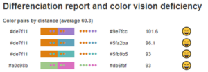
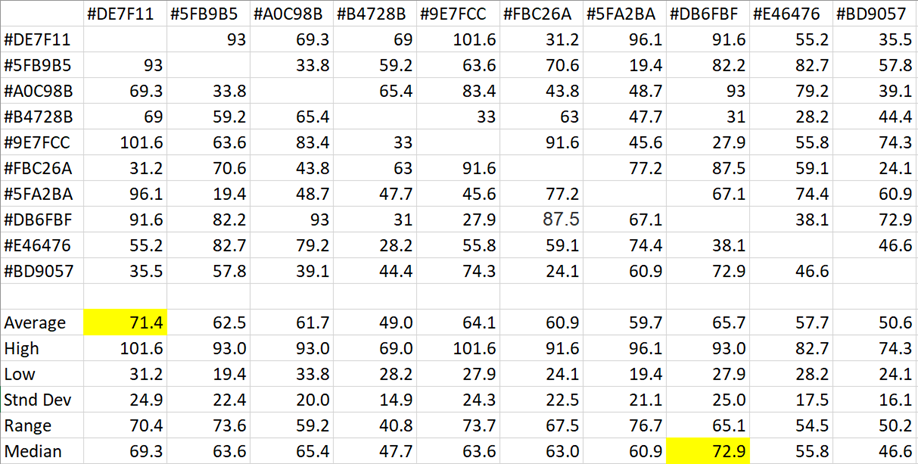
A quick check of the statistics shows us that #DE7F11 has the highest average distance and that #DB6FBF has the highest median distance. This suggests that these two colors are more distant from the others typically. While these calculations are all done on a pair-wise basis, we can also have iWantHue order the colors based on their difference within the three-dimensional color space.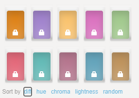
Of course, some visualizations use only one color and some use many, many more. The idea is to use these calculations to give us the best chance of having a non-biased, easy to read graph. We also want to assign colors in an order that allows for easy differentiation visually and in description. Color perception is reliant on color adjacencies, size, placement, and other factors, so there are no perfect solutions. The higher the number we assign to a color, the more often it is used.
The table below shows a recommended order for you to consider:
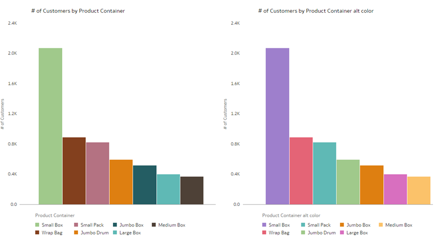
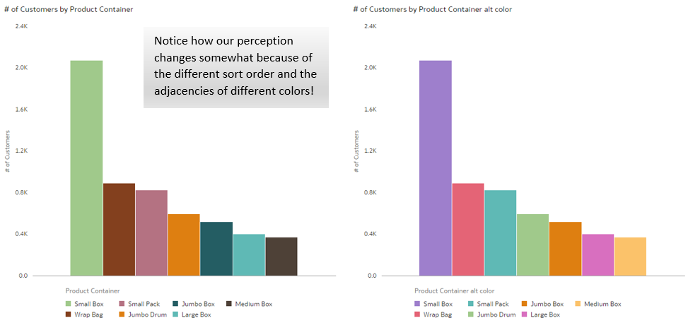
There are still problematic color pairs which are close together, but overall, it’s a far more balanced palette in terms of visual weight. We took care to choose a sort order that minimized the inclusion of problematic adjacent colors (something the original Redwood palette does as well). The major difference is the elimination of the darkest colors. It’s important to note that not all graphs are problematic with the original Redwood color palette, but the chances of introducing an unwanted bias are higher. Note what happens when we change the sort order of the bar graph. We get different color adjacencies and our perception changes somewhat. (Sorted bar graphs are generally preferred.)
Adding a New Color Palette in OAC
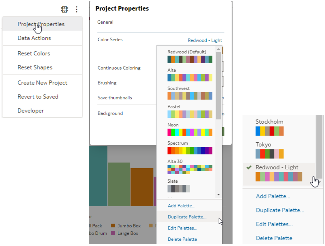
Adding a new color palette is relatively easy in OAC. Simply go to the Project Properties menu and click Color Series. Then select either Add Palette and manually add your colors or Duplicate Palette and edit the colors. (We duplicated the Redwood palette and edited it since it already included most of the colors we wanted.)
What we’re trying to do is find a solution that is compatible with Redwood and minimizes the likelihood that we will unintentionally distort data in our visualizations. It’s very possible that others will come to different conclusions and may have different recommendations. According to Jenny Lam, SVP User Experience Design at Oracle, the new color palette was designed to be more inclusive and reflective of Oracle’s customers around the world – “We literally have customers in every country in the world and we wanted that global story to be reflected in our visual narrative….For us, that translated to warmer colors rooted in shades and imagery that were inspired by art found around the world, not just from the western world.” Oracle has prioritized the need for sufficient contrast between colors for color blind and non-color-blind users.
The care taken in designing front-end interfaces makes an enormous difference in the user experience and the value users receive from an analytics platform. It’s great to start with such a fully expressed solution as the Redwood theme (thanks Oracle!). If your organization wants to take the next step in improving the legibility, objectivity, and effectiveness of your dashboards, projects, and reports, give us a call and we’ll talk through your situation. Thanks for reading!
At Vlamis we’re passionate about the science of analytics and take great pride in getting the details right. We’re always interested in hearing about client use cases and challenges. Please let us know if you have a thorny analytics issue you want to kick around with some people who care and have been in the trenches for years.
Join Dan and Tim on December 7 for their course on Oracle Analytics for Enterprise Data Solutions.