

Not all business intelligence dashboards and analytics projects are worth the same. Some are viewed by hundreds of employees, while others are highly specific and meant to be used by only a few people. Likewise, the business decisions influenced by some dashboards and reports are worth millions of dollars while others have little impact on the bottom line.
So how do you know which dashboards are worth the effort in time and resources to develop?
We often recommend that our clients embrace a consistent scoring methodology or “rubric” to ensure that an appropriate investment of time and resources is expended on a particular dashboard or project. Sometimes, dashboard design projects suffer from having a business sponsor who is either too impatient to invest the needed time and resources to iterate through a series of refinements or has an overblown image of the worth of the dashboard and wants far too much investment. A rubric can help counter both of these tendencies.
We encourage “role-based” dashboards, that is, dashboards designed to serve or support a particular set or group of people. When created without a specific audience in mind, dashboards tend to drift and become unfocused. They fail to deliver actionable insights and clearly communicate summary results of the firm’s position, performance, and flows. If you hear people complaining more about what a dashboard does not have versus what it does have likely one of two things is true: they are not in the role of the intended audience or the dashboard was not designed for anyone or anything specifically and therefore it doesn’t do anything very well.
The Dashboard Importance Rubric
The basic idea of the rubric is to break down the importance of the decisions that are made or influenced by the dashboard to a few key metrics:
- Authority. We know that the authority of a position within a firm may be described by the size/value of the decisions that they make. The more authority a particular role has, the more value that can be ascribed to a dashboard designed to support decision making for that role.
- Organization Coordination. Another measure we often include is the relative amount of coordination across the organization. For example, many higher-level executive dashboards are not limited to a single functional area like marketing or sales or finance exclusively, but rather cut across many functions within an organization. These are particularly valuable dashboards because when executives use the same views, they share a common understanding of the organization’s position and performance.
- Audience Size Score. The number of individuals using or viewing a dashboard increases its value. The rubric uses an index to assign a score of 1 to 10.
Here is the simple rubric we often use. We scale all three measures the same, from one to ten, and then multiply each of them together to get a score for each role. We then add the score for each role to get a total.
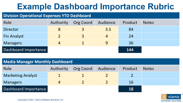
Our example clearly shows that the “Division Operational Expenses YTD Dashboard” has a much higher score than the “Media Manager Monthly Dashboard”. Notice that the “Director” role for the Division Operational Expenses YTD dashboard has the highest single score due mostly to the high “Authority” score. Notice also that both Directors and Financial Analysts have higher “Organization Coordination” scores because their decisions involve a broader cross section of the organization. If someone in a particular role goes to a lot of meetings with people from other functional areas and to coordinate broad decisions, that means that they will have a higher Organization Coordination score. Notice that the Marketing Analyst role has a low Organization Coordination score.
Put more effort and resources into developing and refining dashboards with higher scores than you do into dashboards with lower scores.
You might ask, are these scores somewhat arbitrary? Yes, it takes some time and practice with the rubric in different situations to develop a consistent sense of the difference between an Organization Coordination score of 3, 4, 5, or 6. The important thing is not knowing the absolute definition, but rather having an identified methodology to use so that you can assess the relative importance of different dashboards. The core concept is pretty straightforward — put more effort and resources into developing and refining dashboards with higher scores than you do into dashboards with lower scores.
We find that it’s also easier to discuss a specific score with a stakeholder than it is a more abstract sense of importance. For the person wanting a new dashboard, it’s always a priority and always very important, otherwise they wouldn’t be requesting it! We use the rubric as a method for aligning and allocating resources and helping stakeholders understand what they are asking for. They do not know or realize the resources or effort that can go into development (not should we expect them to know this). Telling someone, “Your dashboard scores about 54 points on the importance scale. That’s a pretty average score and usually means that we allocate 24 person hours of development time for your dashboard.” is easier than asking them “how many hours do you want us to spend on this?” You can also point to other dashboards they may be familiar with and give them a relative score and explain how it was assigned. Having a process also lessens the feeling that they are being arbitrarily pushed down in importance.
To conclude, applying a rubric when evaluating and prioritizing which dashboards to develop ensures a more objective decision-making process. Using the rubric consistently will defuse potential conflicts over the decision making and help others see the relative value of the dashboards that are developed. If you want to talk more about how to apply rubrics in your business setting, give us a call.