

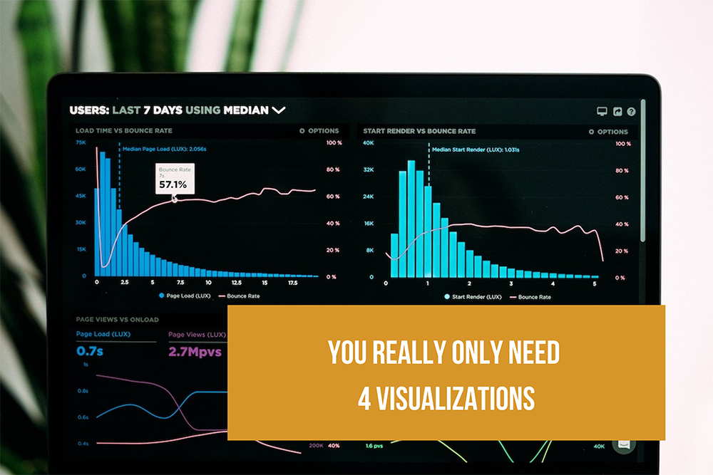
We lead a lot of training on data visualization and we mentor analysts in many of the world’s leading corporations. It’s not uncommon for analysts to ask about advanced visualizations in the beginning of our sessions. Afterall, they are there to learn new things. But just as a master class for musicians may focus on elemental breathing techniques (everyone knows how to breathe, right?), we start with the basics and emphasize why employing these essential visualizations first will satisfy most situations. While there are plenty of exotic and interesting graph types, if you want to accurately show data patterns and values in a clear and non-biased way, you really only need four visualization types: bar graphs, line graphs, scatter plots, and maps.
Bar Graphs
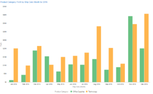
Bar graphs show comparisons, and depending on what we want to compare, we use different styles and arrangements of bar graphs.The human eye and brain are quite good at distinguishing length and these results are consistent across many dimensions of diversity including age, gender, place of origin, and more. Use grouped bar graphs for comparing members among a group or set and stacked bar graphs for comparing total values of a group or set.
Comparing Values
Assess similarities and differences across specified categories
Use bar graphs for comparing values.
- Prefer vertical bar charts for most situations. When bar labels are longer than 12 characters or so, use horizontal bar charts.
- Use grouped bar graphs when the comparison of the individual bars to one another is what matters.
- Do not use gridlines as they often create “ghosted bars” and add visual clutter. Also, typically, you can configure modern software to provide the discrete value when hovering over a bar.
- Always use a zero base on the y-axis. Do not use zoom on the y-axis. The total length of the bar is what carries value.
- Graph change/differences directly as a discrete number if that is the insight needed. Graphing percentage change can also be useful.
Comparing Total Values and Their Component Parts
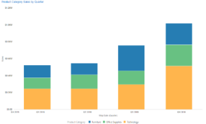 Assess overall category totals with additional context of individual components shown in segments
Use stacked bar graphs, but only when the total value for the stack is most important. The different starting point of bars above the lowest bar makes it hard to compare individual bar segments. When the comparisons of the individual pieces are most important, graph the pieces as separate bars.
Line Graphs
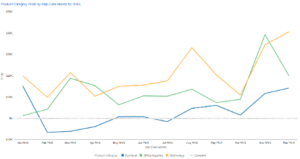
Line graphs help show the pattern or progression of a measure across a continuous range. The best known example is when we want to show a trend clearly over time.
Analyzing Trends
Determine whether values are rising or falling over time
Use line graphs to compare the change in values over time. It’s OK to use a zoomed y-axis for line graphs since the shape of the line is what delivers value. Tall, narrow line graphs emphasize change and short, wide line graphs de-emphasize change. Aim for a “golden ratio” of approximately 1.6 width to height.
Scatter Plot Graphs
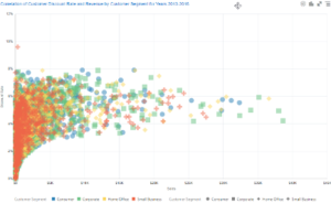
Scatter plot graphs show the relationship between two measures. They are the workhorse graph of science and deserve greater representation on business dashboards because of their consistency in accurately and objectively showing data. They show outliers extremely well while also revealing overall patterns. They are one of the few graph types that can display hundreds or even thousands of data points without distortion.
Discovering Patterns and Outliers
Assess the strength and direction of the relationship between two variables and whether extremes exist in the data
Use scatter plot graphs to determine the overall relationship between two measures.
- Place the independent variable on the x-axis and the dependent (response) variable on the y-axis.
- Color, size, and shape can be added for additional context.
- Using size as a measure reduces the discrete number of points that can be meaningfully shown.
Maps
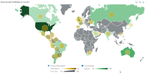 Maps convey multi-dimensional relationships between locations faster and more intuitively than any other graphic medium. Every point on a map is relative to every other point. This means that maps can display an incredibly rich set of data insights.
Discovering Patterns in Location-based Data
Data where geographic location and relative geographic location have importance
Use map views for data that has a physical location.
- Use polygon fills (choropleth maps) for state, county, and other areas with jurisdictional boundaries.
- Use variable shapes (size and color) for specific address locations or to denote data which should be represented by a point and not be distorted by polygon size. For example, you may want to use a single bubble per city that varies in size and color.
- Use multiple layers to show multidimensional relationships simultaneously. Often, individual layers can be turned on and off to reveal different insights in the same map.
Let Content, Not Design, Be the Star
The key consideration is that most dashboards use several graphs that are linked. This enables us to show relationships in highly dimensional data sets through showing different views of the data in different visualizations. A set of four linked bar graphs might show multiple measures for the same set of data elements with each graph offering a different measure or perspective. Interactive graphs that employ brushing or highlighting techniques also reveal important relationships as users interact with the graph. The focus of any dashboard should be to reveal the data and its relationships and patterns in an objective, accurate, and non-biased fashion. When designers add too many visualization types, the focus is shifted away from data interpretation and toward design or even visual entertainment. That may be OK for storytelling or other situations, but for most business dashboards, you want the content, not the design, to be the star.
In summary, start with basic visualization types and consider using others only when you feel there is a specific, overriding need that is greater than the clarity provided by the above four visualization types. Mastery doesn’t come from how many techniques you know; it comes from maximizing the full power of the basic techniques.