

Using visual imagery, or visualizations, is an effective way to communicate ideas, whether abstract or concrete. The presentation of data in visual form, typically through graphs, maps, charts, and small tables is often collectively referred to as “data visualization”. When we use numbers to create visualizations, we have entered the realm of data visualization. Within the practice of data visualization, it’s extremely important that we create presentations that accurately represent data values in a non-biased manner that is consistently interpreted across diverse user populations. We use the science and principles of human cognition to guide the choices we make regarding which graphs to use for different use cases and to guide design choices such as aspect ratio, color choice, and other stylistic decisions. Think of it this way, just like a chef prepares a dish and works to make the natural flavors of the ingredient present, we work to show the numbers and not mask or alter them.
Graphs and Tables Are the Most Common Elements of Data Visualization
Data visualization is the science and art of designing dashboards and displays that show a visual presentation of data needed to manage or guide an organization or activity. There are several components of typical executive or managerial dashboards, but the two most prominent ones are graphs and tables. They serve different purposes and should be used in combination with one another. Generally, at least 60% of a dashboard should feature graphs and charts because they communicate relationships, patterns, trends, and outliers much faster and much more consistently across diverse groups of users. Perceiving and understanding a data-driven insight is different than knowing a specific value. Just as a picture can say more than a thousand words, a graph depicting data as an insight can communicate more effectively than a giant table of numbers.
Graphs show visual representations and relationships.
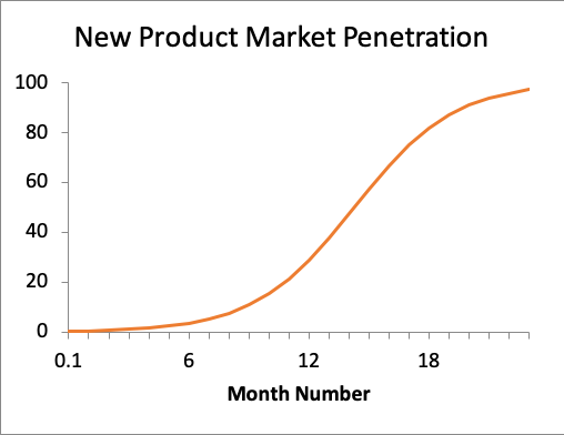
 This line graph shows how market penetration has risen along an “S” curve that slowly accelerates and then decelerates during the first 24 months of introduction. It’s not the specific values or points of the line that create an understanding, but the overall pattern and “story” of market penetration.
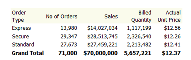
Tables show data organized for looking up specific, precise values or items.
This table enables users to quickly find the value for a specific order type. Tables start to lose their value for quick look-up when they get too large in size. Research suggests that people are not very good at comparing numbers in tables.
Just as graphic elements in a website work together to convey information, graphs and other visualizations should be understood within a layout or interactive screen. Business intelligence or analytics dashboards form the foundation for a common view of enterprise performance, position, and flows. This evidence can then guide people within an organization to make individual and collective decisions more easily and more quickly and to have far greater buy-in and support from others in the organization.
Dashboards are Visual Displays that Organize Complex Organizational Data for Sense Making
The coherence that comes from many people understanding the same evidence and insights is often overlooked as a key benefit from dashboards designed with data visualization best practices. Different people can look at a large pivot table full of numbers and come away with very different insights and understanding. When people look at a group of graphs that highlight certain relationships and comparisons, there is far less chance that people will see things differently. Shared understanding in organizations is what facilitates good, consistent decision making.
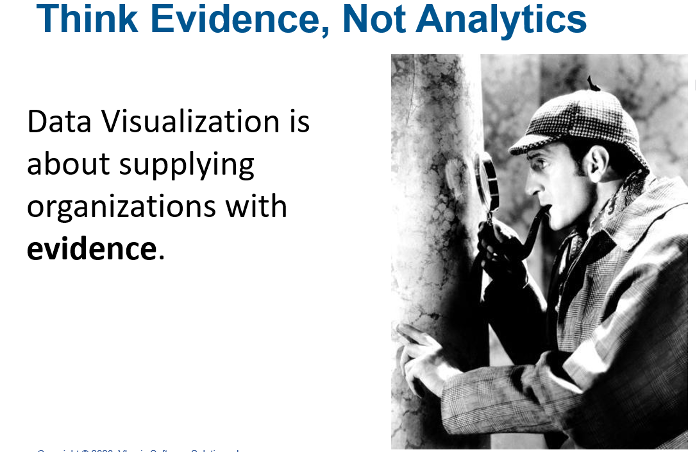
Sherlock Holmes searches for evidence and objective data.
Role-Based Dashboards Drive Coherence
Dashboards and displays should be designed with specific audiences and roles in mind. While individuals may want supplementary information, the more consistent the display and subsequent understanding of organizational position and performance, the more consistent decision making is likely to occur. Design dashboards for roles, design them to show the information that a person in that role needs for making good, consistent decisions. While the customers in the midwestern sales territory may be different from the customers in the southern sales territory, the role of regional sales manager is the same and the objective evidence needed to make consistent, effective decisions for the organization is likely to be very similar. The design for their main dashboards should be consistent. Consistent dashboard design also means that development time is lessened, and that new people can effectively use analytics dashboards much more quickly.
Evidence-Based Decision-Making Means Avoiding Conscious Bias
Organizations must balance many things when they are making decisions and the most straightforward approach to the presentation of evidence is to be as objective and transparent as you can. Having a strong design process and visualization standards that replace arbitrary personal preference with consistent guidance help everyone in an organization achieve a shared understanding. The goal is to minimize unconscious bias and to achieve consistency in decision making. The goal of data visualization is to represent data efficiently, effectively, consistently, without bias and misrepresentation so that as many people as possible understand the same data insights.