

Finally, people are talking about color perception! Everybody is talking about the white/gold/blue/black dress that has gone viral as people discover that color perception is not absolute.
We cover this in our recent Oracle Press book on Data Visualization for Oracle Business 11g. From page 273: ‘We the authors often show a handful of optical illusions involving color perception/misperception during our data visualization workshops to drive home the point that we humans don’t see color as much as we “experience” it as our brains attempt to construct a color model for a given situation.’ In our presentation from BIWA Summit 2015 we showed a color spiral image.
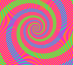
Most people we talk to see a green and a blue spiral. In our presentations, we use a moving circle to demonstrate that these colors are actually the same value: RGB 0,255,151. Cick on the thumbnail of the spiral and take a print screen and use the eye dropper tool in Paint if you don’t believe me! Our brains perceive the colors differently because of the adjacency of other colors.
This becomes very important in constructing business intelligence dashboards. Color selection on dashboards affect how we perceive the data and the business insights obtained in ways we don’t even recognize. For sequential data, use sequential color schemes (e.g. increasing shades of blue for color-coding states based on increasing Revenue amount); for qualitative data use qualitative color schemes (e.g. various pastel colors of equal darkness to represent various brands).
For more information on the book that brother Tim Vlamis and I published in 2015, see our web page at www.vlamis.com/DVforOBI.